Nigeria Design System
Making the design system that works.
Role
Product Designer, User Research
Team
PM, brand & product designers, UX/content writers, illustrators
Client
Nigerian federal government digital products
Status
Live & open-source
Overview
A design system is a shared set of standards, guidelines, and reusable components that helps teams design and build digital products more efficiently and consistently: a single source of truth for typography, colour, layout, and interaction patterns.
The problem
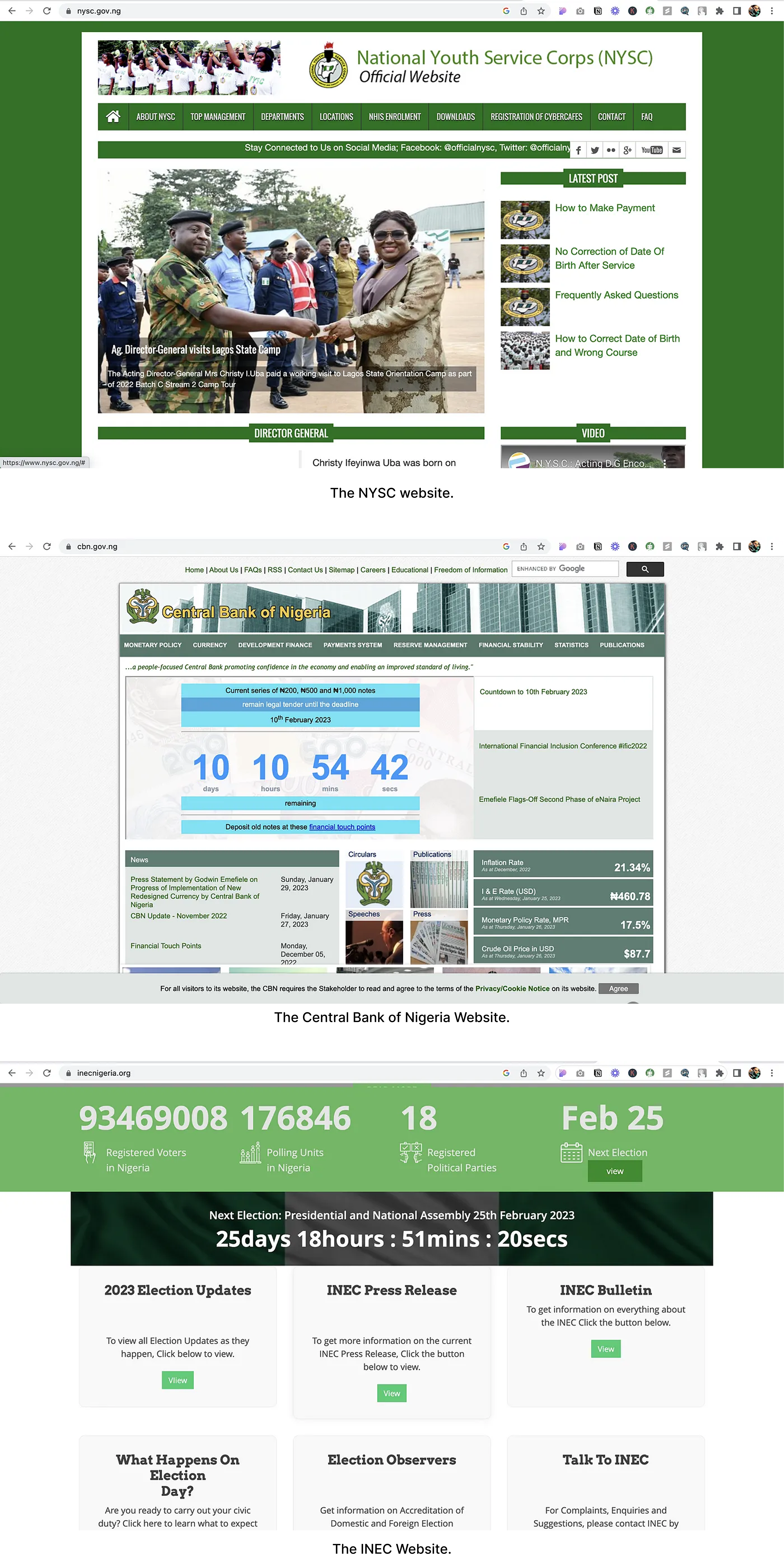
The federal government of Nigeria operates numerous websites and digital applications, each with its own design language and user experience. That inconsistency is confusing and frustrating for citizens trying to access government services online, and it leads to wasted effort: designers were recreating the same common UI elements and patterns for every new project.
Approach
We proposed building a design system with a shared set of visual design principles and styles, plus a library of reusable UI components and patterns for use across all federal government digital products, improving the experience for citizens and increasing efficiency for government design and development teams.
The team consisted of a product manager, brand designers, product designers, UX and content writers, and illustrators.
Research
We ran user research to understand common pain points and needs across government digital products, and surveyed design teams for their input and perspective. That research pointed to three goals for the system:
- Promote consistency in the user experience
- Reduce design and development time by providing reusable components
- Enable teams to iterate on designs quickly while maintaining brand consistency
Definition
Based on that research, we defined the system's scope as:
- A shared set of visual design principles and styles
- A library of reusable UI components and patterns
- A design process and documentation to guide teams in using the system
Design
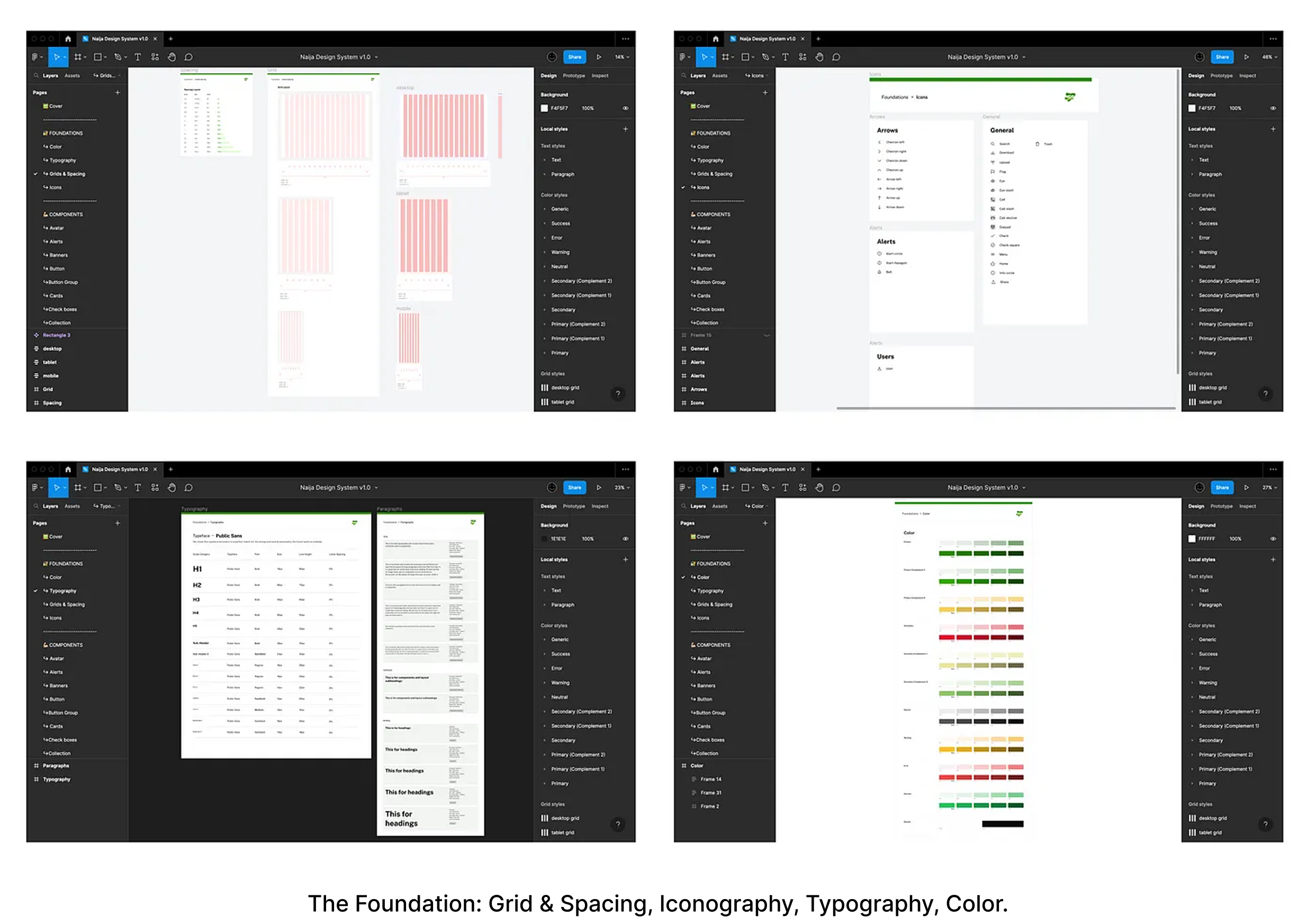
We started with foundations (colour, typography, grid and space, and icons), then identified the most commonly used UI components and patterns across federal government platforms and built them into a shared library.
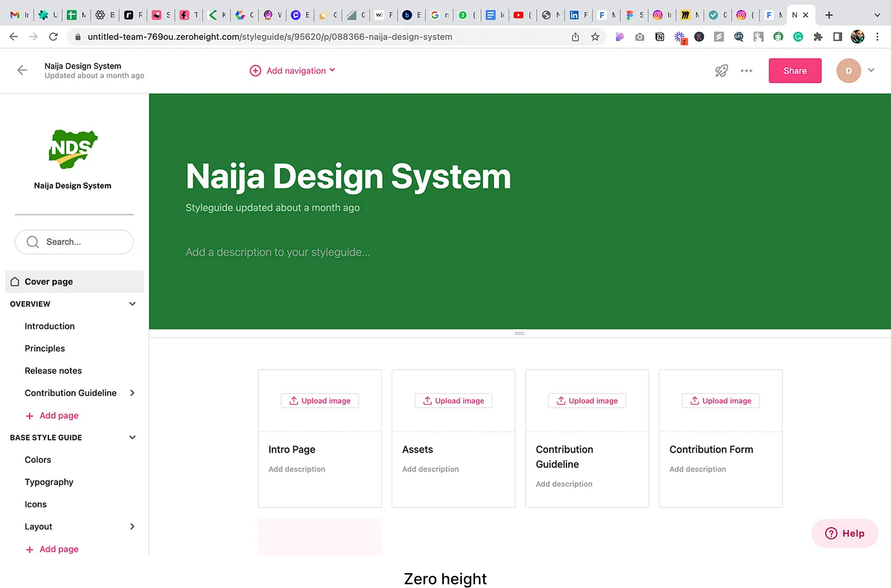
Finally, we documented everything so teams could find and use the system's resources, including guidelines for each component and a process for submitting new components or change requests.

Outcome
The design system is live and open to contributors who want to help maintain and scale it, a shared foundation for consistent, cohesive government digital products instead of every team rebuilding the same UI from scratch.
Next project
Ecospaces